|
Landscape Painting
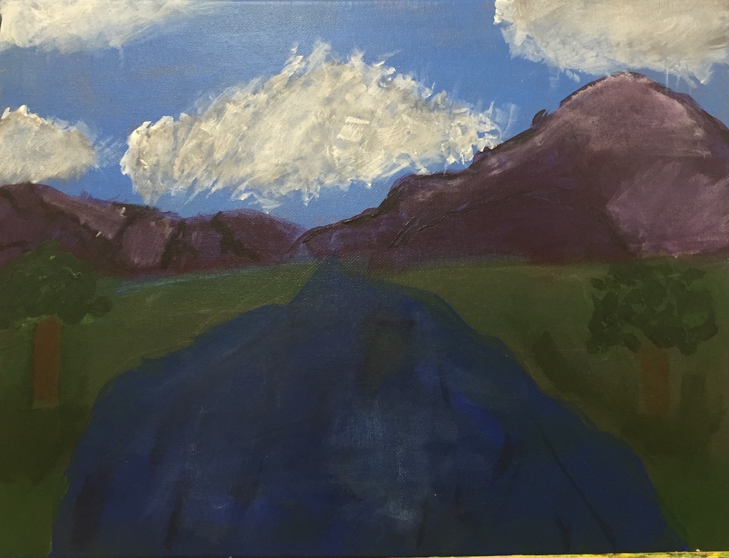
My painting was of a picture that I took while in Alaska. This painting was challenging for me to do because I am not an experienced painter and therefore it was okay. I used purple as the mountain colors because the distant mountains lose color and become darker. This project really helped me for the future on how to make colors seem darker or more bland. I also made some of the other colors brighter that makes this painting pop. The idea of having the main parts of the painting stick out and others stay dull makes the painting better. |
|
Clay Tile
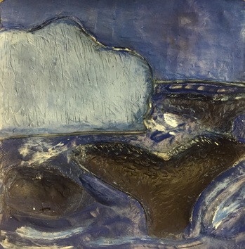
The clay tile project was more challenging that I expected. I thought that during clay making molding and designing would be really easy but I quickly found it was not. The challenge in this was carving out texture and surrounding details of the picture. I had some struggles when trying to incorporate the whale tail. I tried to have the effect of the tail coming out of the water but the clay would not stand straight up correctly. I decided to have it on the ground instead of coming out of the bottom of the tail. I was able to carve into the tile to make it look like waves were three dimensional and as if the are crashing off the tile.
The clay tile project was more challenging that I expected. I thought that during clay making molding and designing would be really easy but I quickly found it was not. The challenge in this was carving out texture and surrounding details of the picture. I had some struggles when trying to incorporate the whale tail. I tried to have the effect of the tail coming out of the water but the clay would not stand straight up correctly. I decided to have it on the ground instead of coming out of the bottom of the tail. I was able to carve into the tile to make it look like waves were three dimensional and as if the are crashing off the tile.
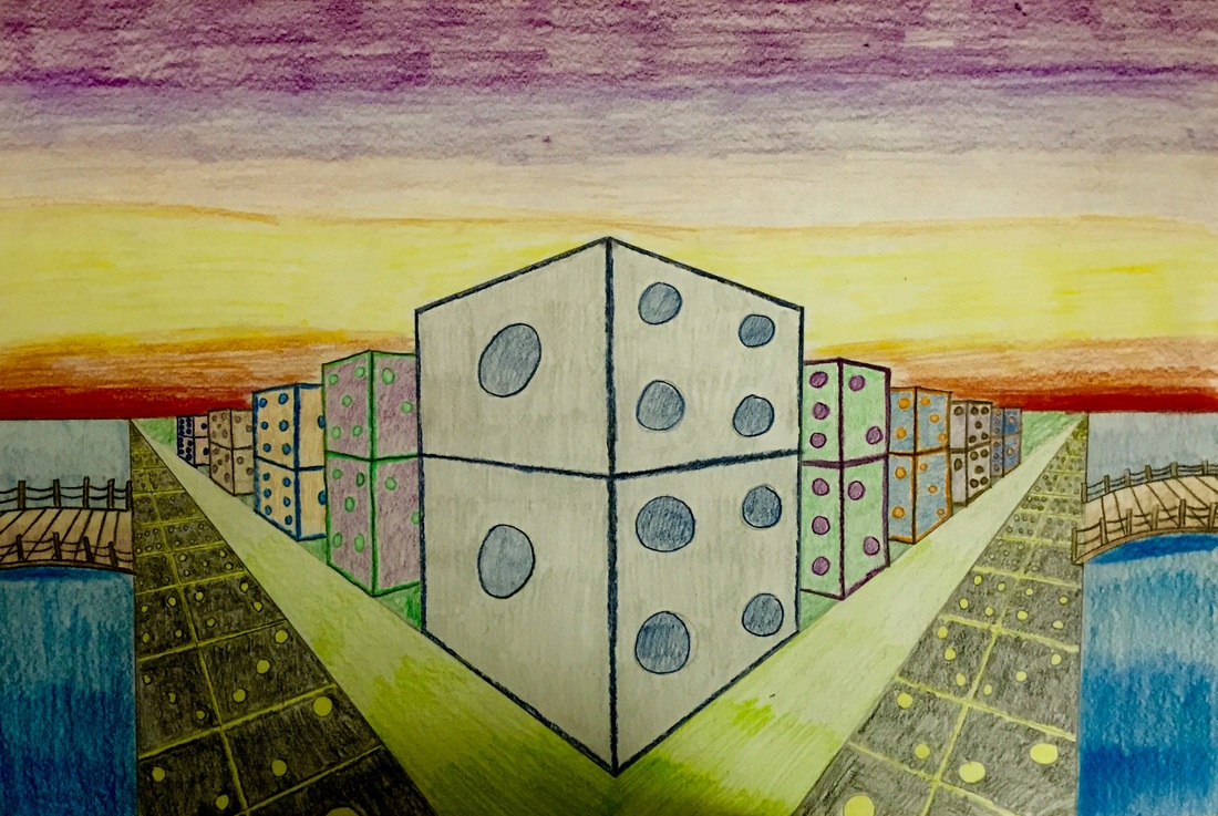
Two-Point Perspective
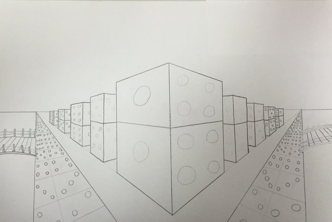
What I like the most out of my drawing is that the perfectly straight lines correlate with the curved lines to create a better perspective piece. This art work shows off the colors I like to see in my perspective drawing. I decided to be very symmetrical in my drawing by reversing the colors on the dice buildings. The opposing colors in each of the buildings went together well using one bright color and one dark color. After finishing the project i was not thinking that the curved bridge would look as good as it did with the straight buildings and streets. The curved lines changed the appearance of the perspective by adding the look of the earth curving in the picture even though the city is on a flat piece of land.
What I like the most out of my drawing is that the perfectly straight lines correlate with the curved lines to create a better perspective piece. This art work shows off the colors I like to see in my perspective drawing. I decided to be very symmetrical in my drawing by reversing the colors on the dice buildings. The opposing colors in each of the buildings went together well using one bright color and one dark color. After finishing the project i was not thinking that the curved bridge would look as good as it did with the straight buildings and streets. The curved lines changed the appearance of the perspective by adding the look of the earth curving in the picture even though the city is on a flat piece of land.
|
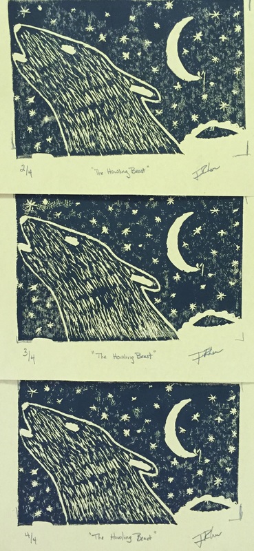
Print Making
This is my favorite so far because it was my most interactive with my type of project. My knowledge improved during this project by learning a vocabulary word of Breyer. This is the rolling thing that puts the paint on the print. I also asked so kids that sit beside me on things i can improve on. I asked things like: Should I add anymore stars? and Does this fur look realistic or really fake? My fellow classmate then responded with their thoughts that helped me improve my artwork and final piece. During research of this piece, I used my phone in order to find pictures that I could include in my artwork and make it the best it can be. My artwork took me a while to complete but I feel that it is my best work and came out good. 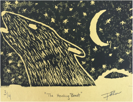
|
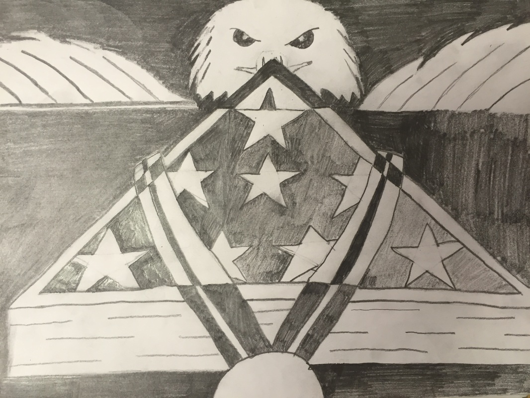
Black and White Cutout
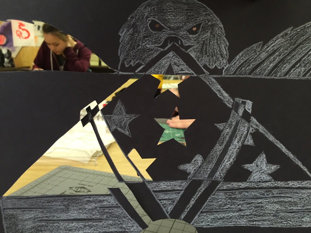
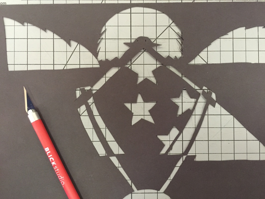
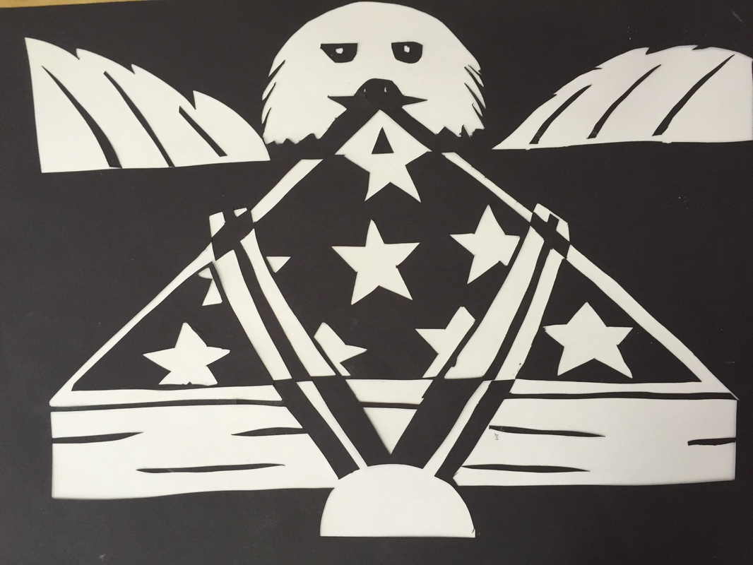
During this project I learned the ways of using an X-ACTO knife to the best of my abilities. The challenge during this project was my ability to use an X-ACTO knife. This tool was hard to use because the curves had to be cut with a straight edge. I also learned that my drawing skills are greater when I am able to look at a picture and draw something similar to it. The artwork I made was unique in that I combined some war awards as well at the symbols of the American country. The eagle in the background shows the bird and a symbol of the American way. The Medal shows the award in which this person won as well as the American Flag encased. Some of the cuts taken on my paper were very small. Therefore these were harder to cut and were easily broken if the lines were too close.
During this project I learned the ways of using an X-ACTO knife to the best of my abilities. The challenge during this project was my ability to use an X-ACTO knife. This tool was hard to use because the curves had to be cut with a straight edge. I also learned that my drawing skills are greater when I am able to look at a picture and draw something similar to it. The artwork I made was unique in that I combined some war awards as well at the symbols of the American country. The eagle in the background shows the bird and a symbol of the American way. The Medal shows the award in which this person won as well as the American Flag encased. Some of the cuts taken on my paper were very small. Therefore these were harder to cut and were easily broken if the lines were too close.
Portrait of Andrew the Magnificent
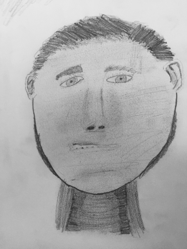
When drawing the portrait of my main man, Andrew, the details were really challenging. In order to get the perfect values of Andrew's face, I used some special blending techniques. These techniques were quite helpful in performing this challenging face. The most challenging feature on this face was the nose due to the amount values on it. Another challenging part of Andrew was his ears. I have always been bad at drawing ears but this was quite possibly the hardest one I have ever done. The final product for this task turned out to look similar in some categories and completely WRONG in others.
When drawing the portrait of my main man, Andrew, the details were really challenging. In order to get the perfect values of Andrew's face, I used some special blending techniques. These techniques were quite helpful in performing this challenging face. The most challenging feature on this face was the nose due to the amount values on it. Another challenging part of Andrew was his ears. I have always been bad at drawing ears but this was quite possibly the hardest one I have ever done. The final product for this task turned out to look similar in some categories and completely WRONG in others.
|
|
Cartoon Skeleton
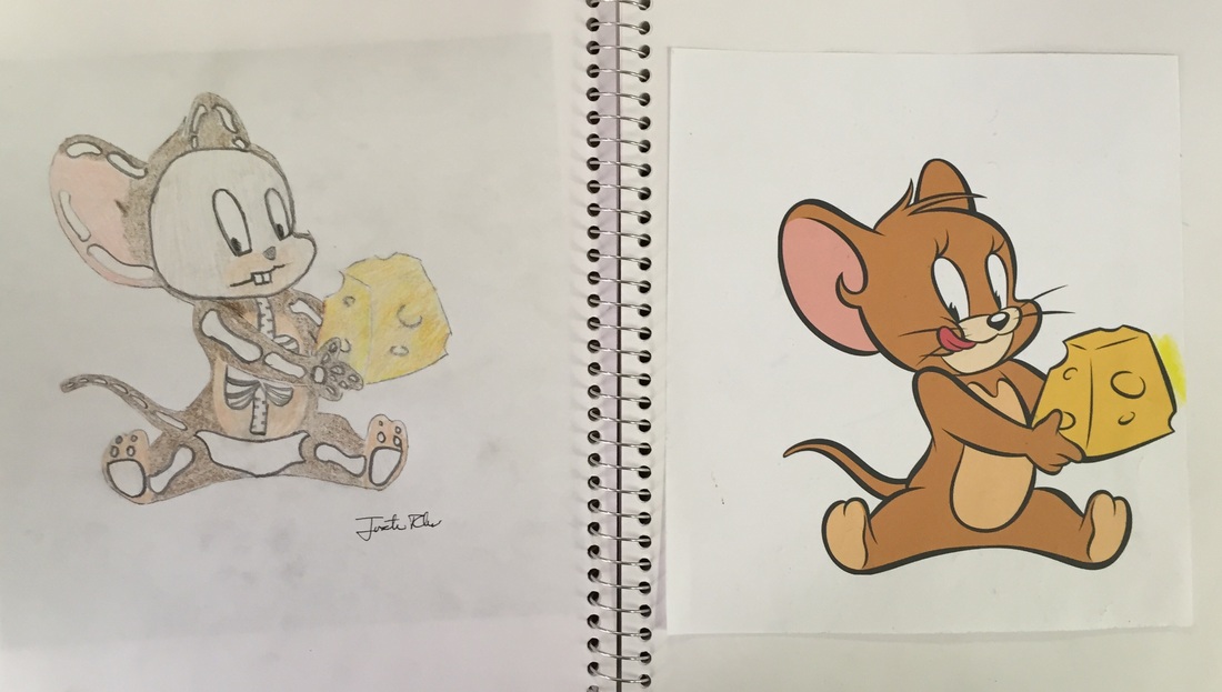
The cartoon skeleton project was enjoyable yet very tiring and challenging. Making sure all the details needed to create your skeleton were in the right spot. Continuing to draw the bones afterward was also a real stress. The most challenging part of this project due to the fact that if the character did not have a head or torso that you must find a place for the pelvis or the skull. The drawing I did was of Jerry the Mouse eating a piece of cheese. The arm of Jerry was behind the piece of cheese making it impossible to draw the other arm. I decided to color this drawing to show where each part of his body started and ended which showed the challenges of finding every bone.
The cartoon skeleton project was enjoyable yet very tiring and challenging. Making sure all the details needed to create your skeleton were in the right spot. Continuing to draw the bones afterward was also a real stress. The most challenging part of this project due to the fact that if the character did not have a head or torso that you must find a place for the pelvis or the skull. The drawing I did was of Jerry the Mouse eating a piece of cheese. The arm of Jerry was behind the piece of cheese making it impossible to draw the other arm. I decided to color this drawing to show where each part of his body started and ended which showed the challenges of finding every bone.
Handimal
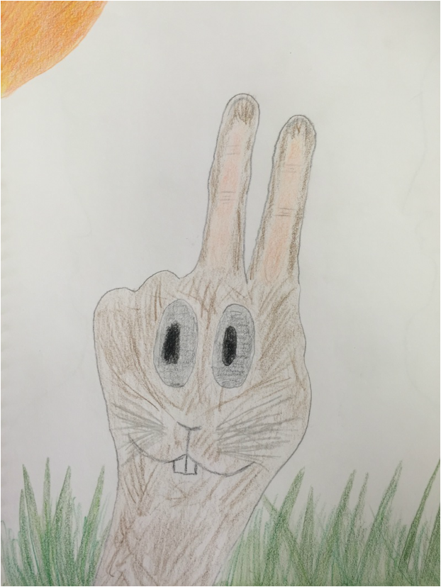
The animal I chose was a rabbit and drew it on a hand peace sign. The hand was challenging to draw on the way that I thought it had to be perfect because I was going to post an animal on it. The animal part of the hand was also challenging because the shading had to make it look realistic. Without the shading the animal would look flat and not like a rabbit. My animal fit on my hand well even though the bunny ears were on the same side of the head. I feel that the best way for me to increase the talent used during this project, I could have picked a different animal and/or hand position to draw on it.
The animal I chose was a rabbit and drew it on a hand peace sign. The hand was challenging to draw on the way that I thought it had to be perfect because I was going to post an animal on it. The animal part of the hand was also challenging because the shading had to make it look realistic. Without the shading the animal would look flat and not like a rabbit. My animal fit on my hand well even though the bunny ears were on the same side of the head. I feel that the best way for me to increase the talent used during this project, I could have picked a different animal and/or hand position to draw on it.
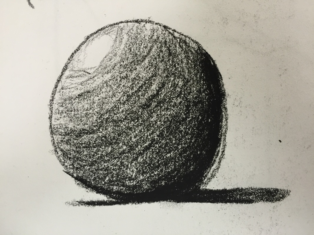
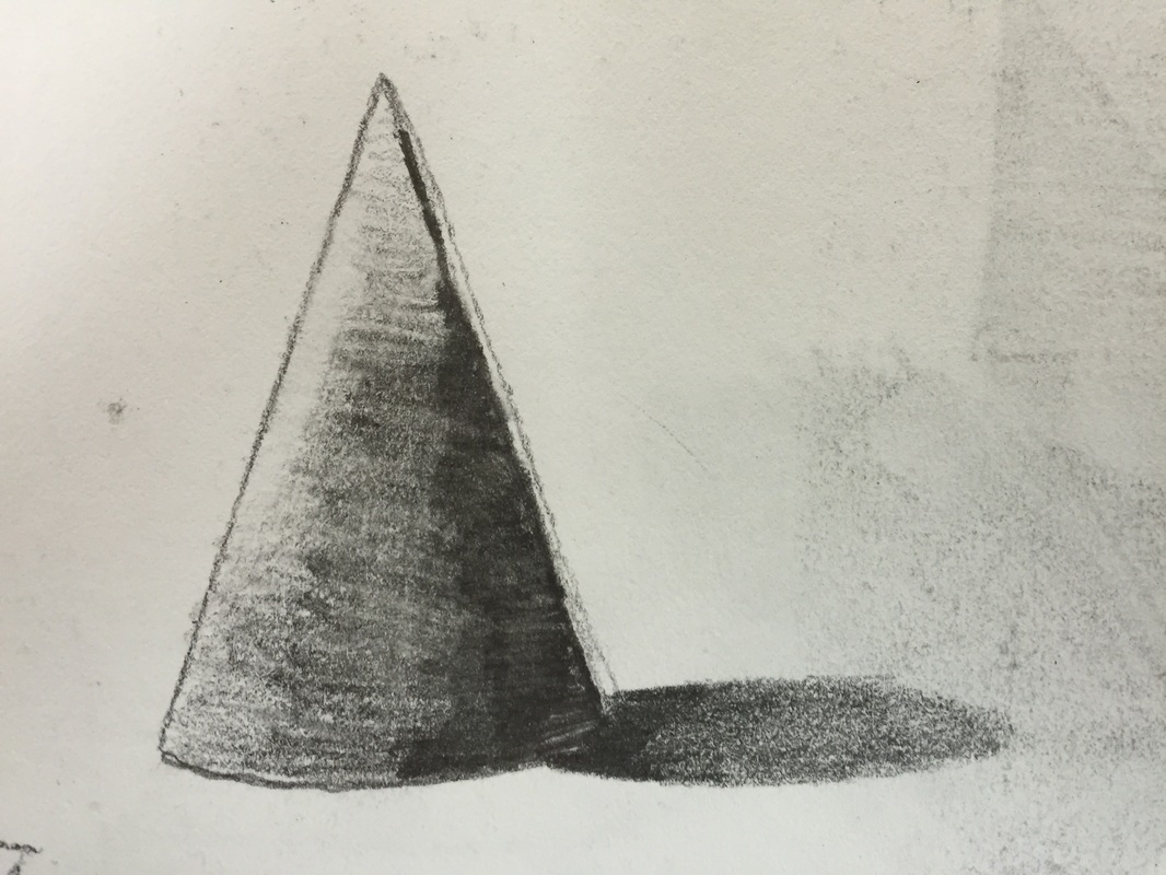
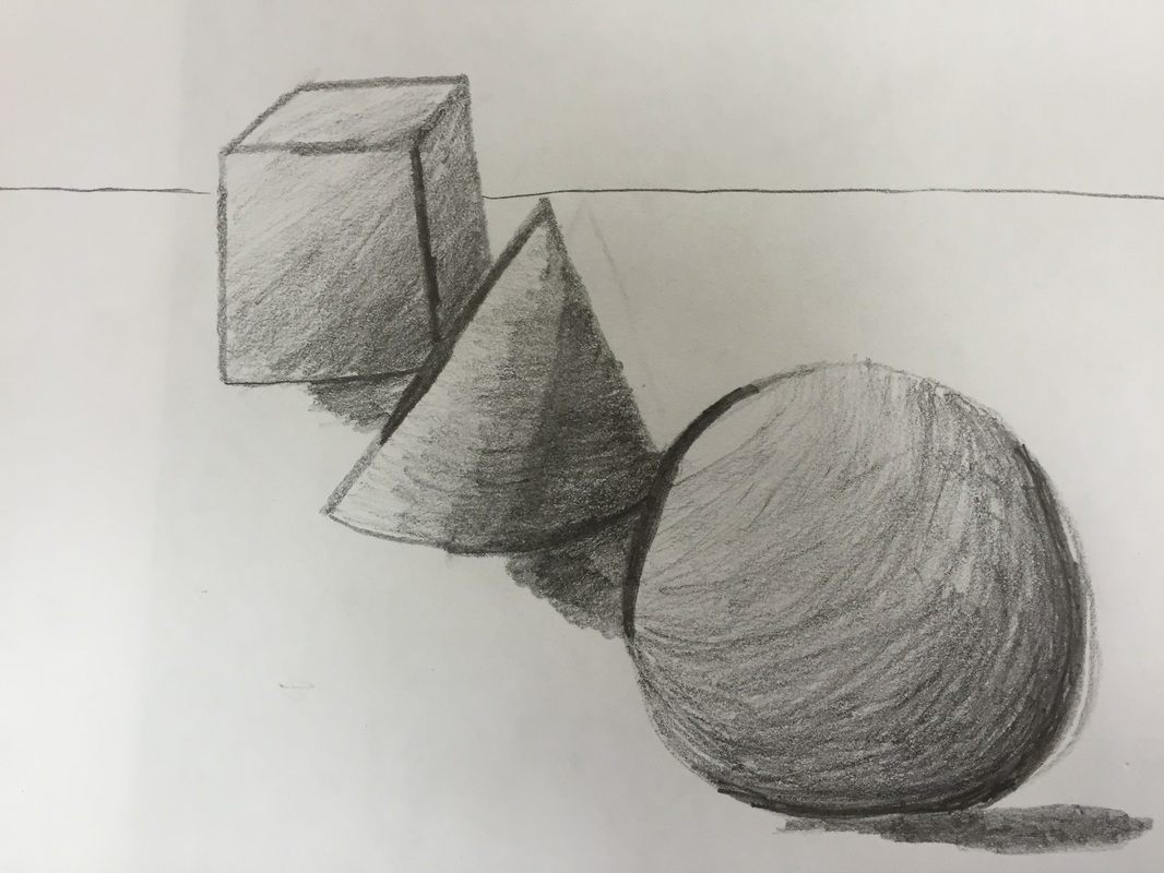
Shading Chart
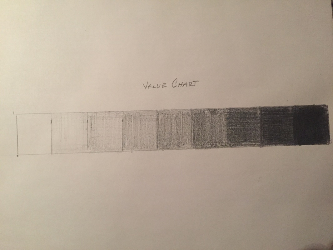
The idea of shading is very important in the fact that shading allows for the show of depth of an object on a surface. Also, shading shows the shape of the object but showing shadows and bright spots. Drawing does not always include shading yet most people create better drawings by increasing the amount of shading. Most of the drawings shown without shading do not show the surface of the shape. The shoe that I uploaded last did not include shading. Therefore, the drawing was less realistic and created a certain outlook on the drawing just by it being flat.
The idea of shading is very important in the fact that shading allows for the show of depth of an object on a surface. Also, shading shows the shape of the object but showing shadows and bright spots. Drawing does not always include shading yet most people create better drawings by increasing the amount of shading. Most of the drawings shown without shading do not show the surface of the shape. The shoe that I uploaded last did not include shading. Therefore, the drawing was less realistic and created a certain outlook on the drawing just by it being flat.
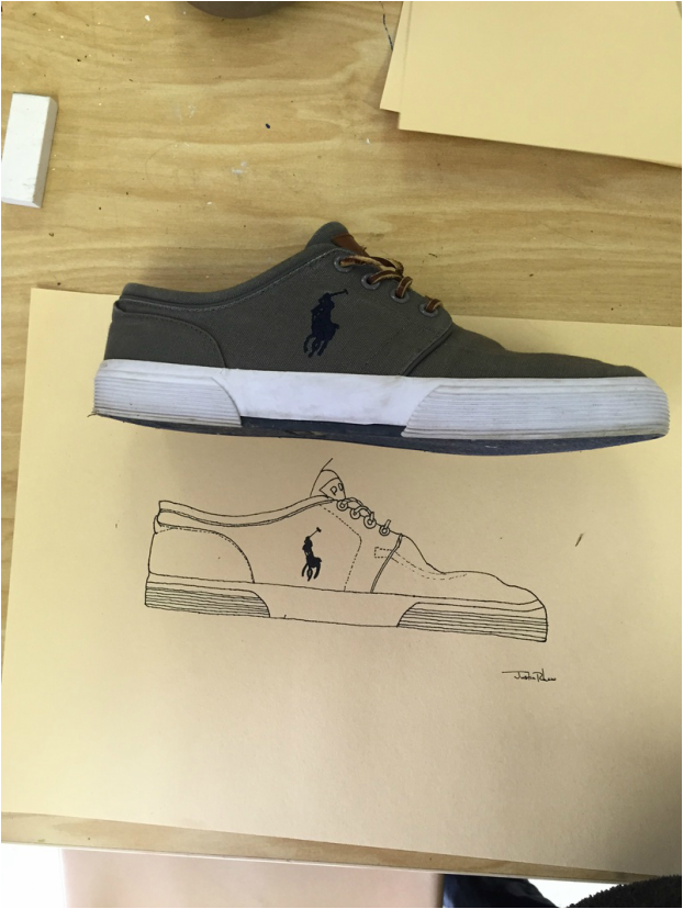
Contour Shoe
The Drawing of my shoe was my most favorite thing up to this point. I enjoyed this the most because I was able to compare my shoe up close. The most challenging part of this project was making sure the shoe was actual size. The goal was to draw actual size and the following drawing was close. I think that overall the drawing of the Polo shoe I drew during class was to the best of my ability and was good. The way to make this better would be to increase the size to actual size and shading now that we have learned shading techniques.
The Drawing of my shoe was my most favorite thing up to this point. I enjoyed this the most because I was able to compare my shoe up close. The most challenging part of this project was making sure the shoe was actual size. The goal was to draw actual size and the following drawing was close. I think that overall the drawing of the Polo shoe I drew during class was to the best of my ability and was good. The way to make this better would be to increase the size to actual size and shading now that we have learned shading techniques.
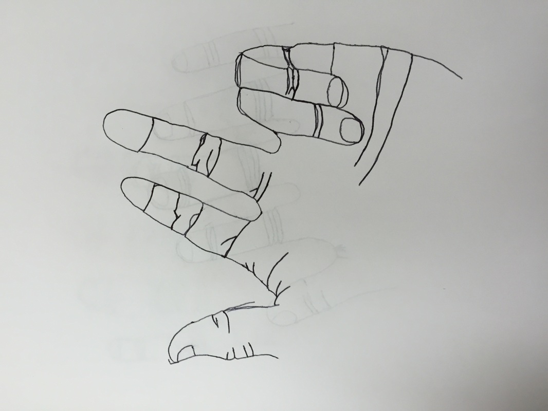
Contour Hand Drawing
A contour drawing of a hand is quite challenging due to the fact that many of the lines you try to draw do not come in right. When watching yourself draw the hand, thoughts come into mind on how you can change yours and make it better. When a person tries to correct something that looks wrong to them during the drawing, the sketch comes out deformed. I personally think that the blind contour drawing was easier once I got the hang of it because my opinions did not affect what I was drawing.
A contour drawing of a hand is quite challenging due to the fact that many of the lines you try to draw do not come in right. When watching yourself draw the hand, thoughts come into mind on how you can change yours and make it better. When a person tries to correct something that looks wrong to them during the drawing, the sketch comes out deformed. I personally think that the blind contour drawing was easier once I got the hang of it because my opinions did not affect what I was drawing.
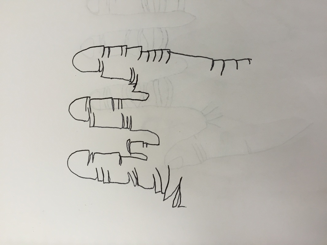
Blind Contour
The first time i ever created a blind contour drawing the results were awful. The lines where all over the place and it looked like a cat had scratched the paper. After practice it became easier by also not removing my pencil from the paper at any point. The drawing was challenging due to the fact that we were not allowed to look at our paper at all creating total blindness towards our drawing. I felt as if it made my drawing better because i was not critical on my drawing while drawing it.
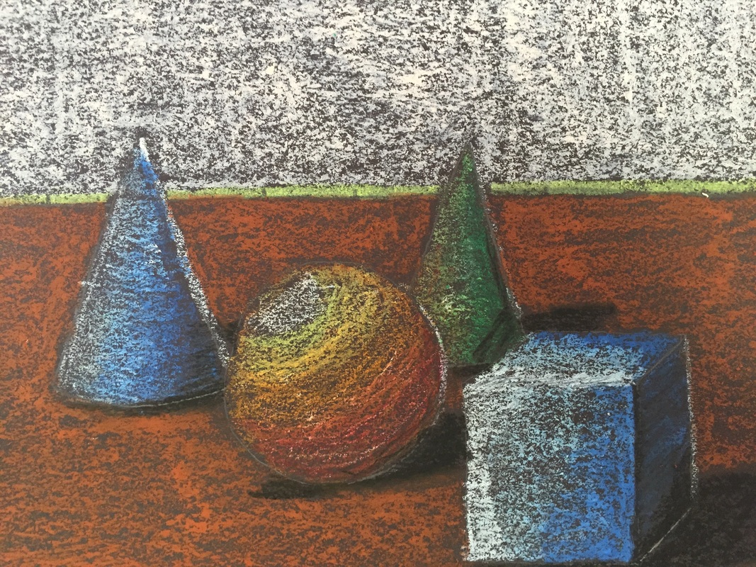
- Oil Pastels 2/3/2015
I began using the Oil Pastels to create the drawing of 4 objects on a table. At the beginning value was an issue but after practice the values came easier. By layering the pastels, the color became darker or lighter depending on how many times you went over it. To blend colors you overlap the colors multiple times. This also showed the depth of each of the objects drawn. The light source is easily shown by the darkness fading into the brightest value. Value of the object is very important while drawing something to show the light source and depth in which the object is sitting.